The Art of Neutrals: Crafting a Timeless Palette for Your Space

Written By
Maria
5 Minutes
What we did
Often we find ourselves drawn to the quiet elegance of a neutral color palette. While some may consider neutrals a "safe" choice, we see them as an opportunity to create a rich and layered canvas that speaks volumes without saying a word. Designing with neutrals requires careful thought and intention, especially when aiming for a look that is both timeless and deeply personal. Here’s a glimpse into our thought process for developing a neutral palette for a recent project.
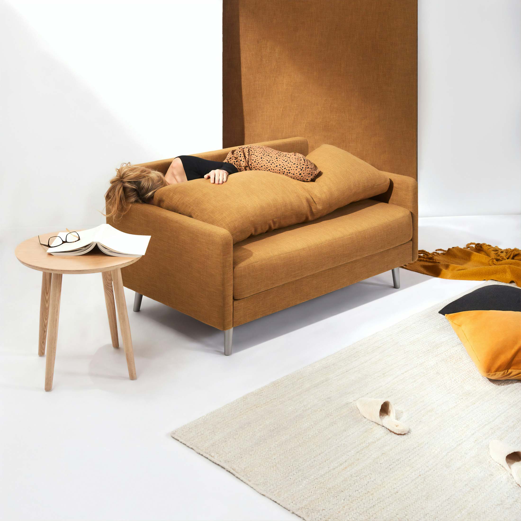
We crafted an elegant interior for a luxury apartment on Perry Street, London that balances sophistication with a sense of calm. The design features a palette of earthy muted tones, anchored by exquisite white marble surfaces that add a timeless touch to the space. We incorporated blue and white furniture to bring a refreshing contrast, adding depth and character to each room. Thoughtful accents, like textured fabrics and natural finishes, seamlessly blend comfort with contemporary style. The result is a serene, inviting sanctuary that perfectly reflects the client's refined taste and complements the vibrant energy of London living.
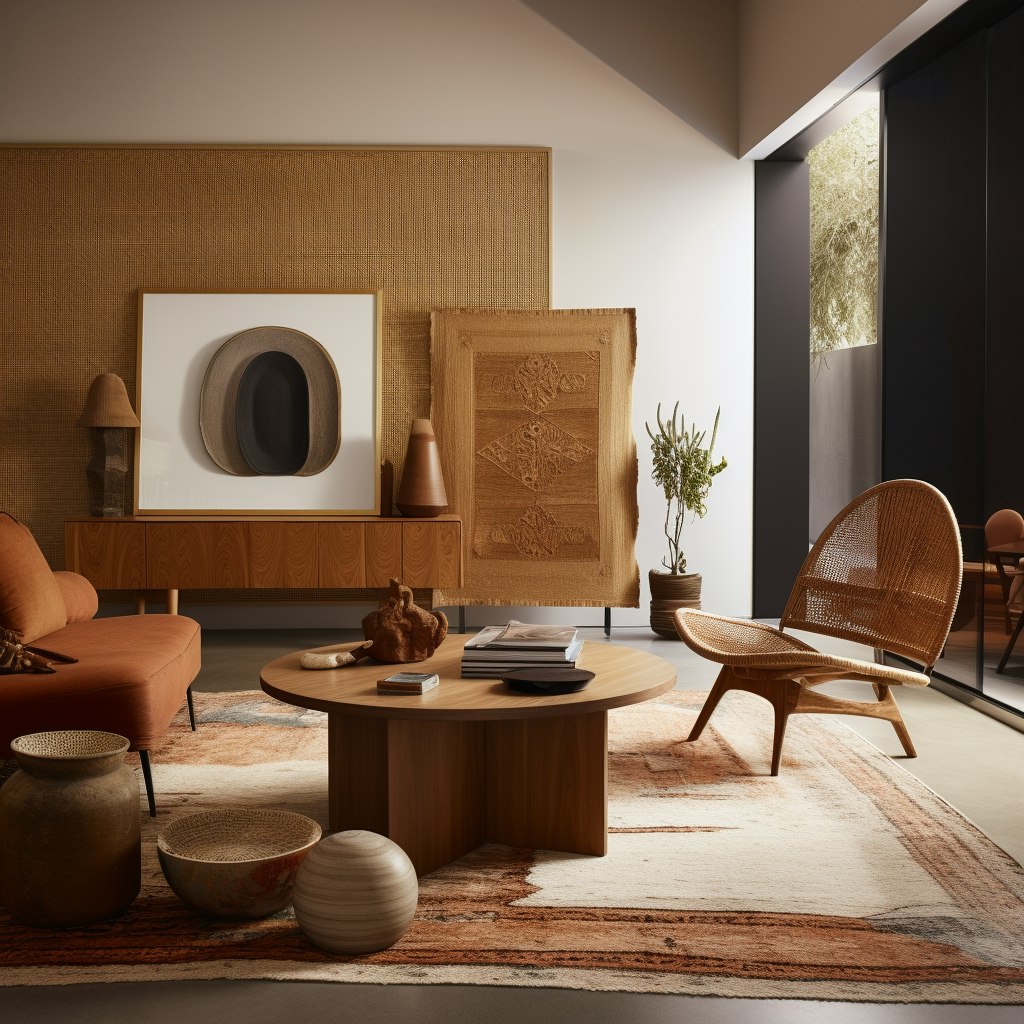
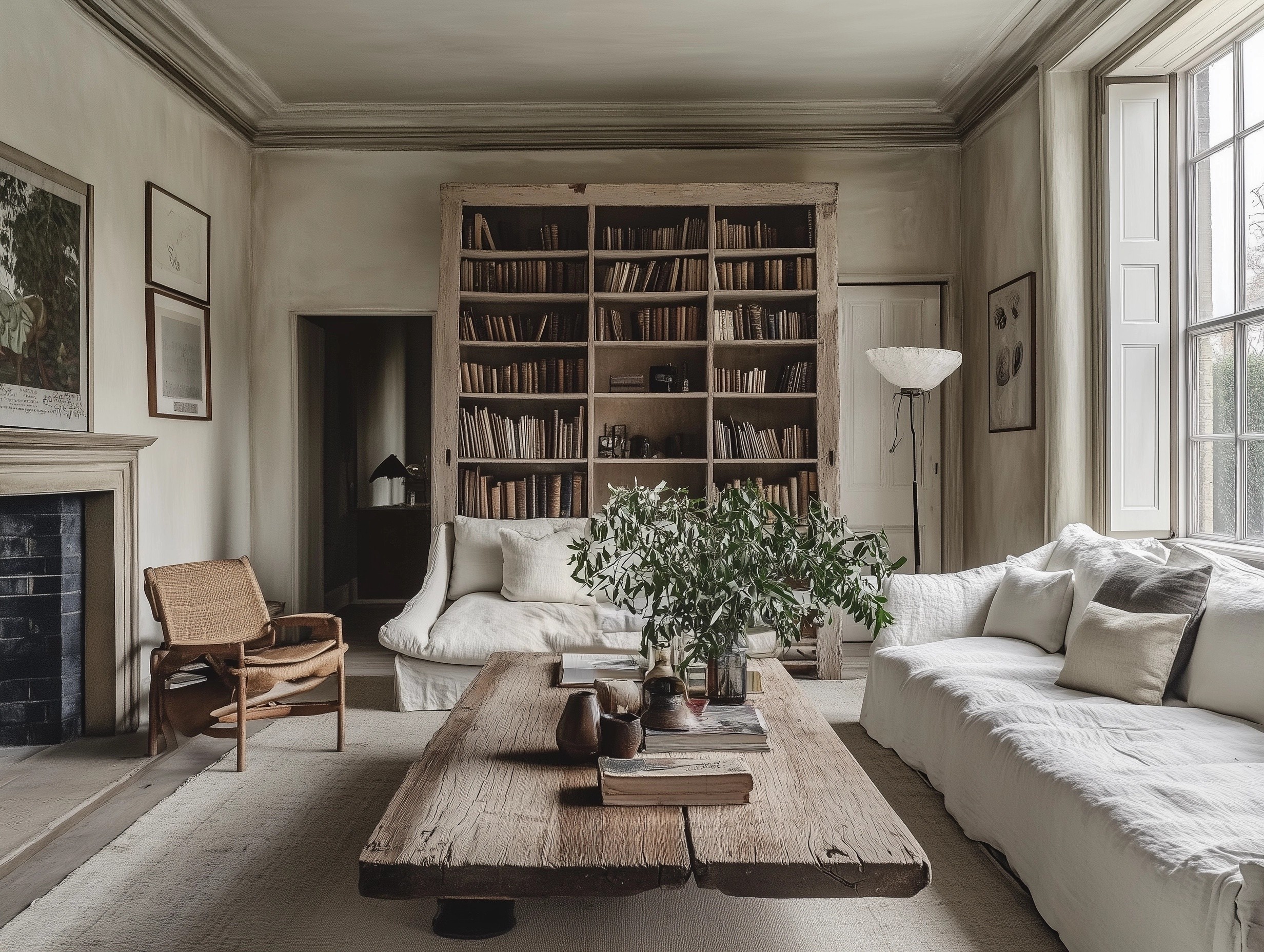
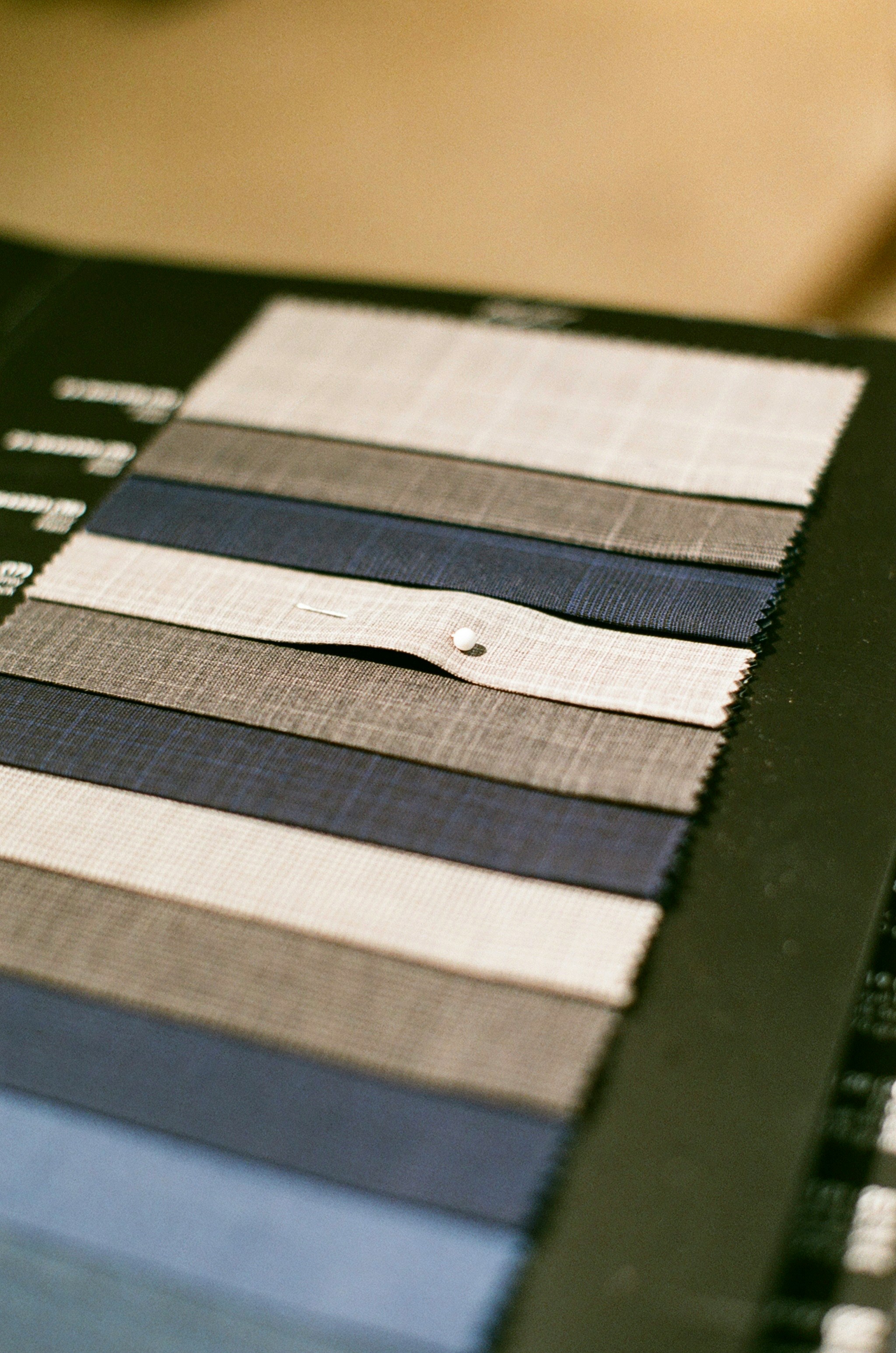
When we begin working with a neutral palette, our first step is to understand the space itself—its natural light, architectural features, and the mood we want to evoke. For this project, a serene living room redesign, we chose a base palette of soft, warm grays, and creamy whites, accented with muted earthy tones like taupe and sand. These colors provide a sense of calm and openness, enhancing the room's natural light while creating a welcoming and comfortable atmosphere. Layering various shades and textures, such as linen upholstery, wool throws, and wooden accents, adds depth and interest, ensuring the space feels anything but flat or uninspired.
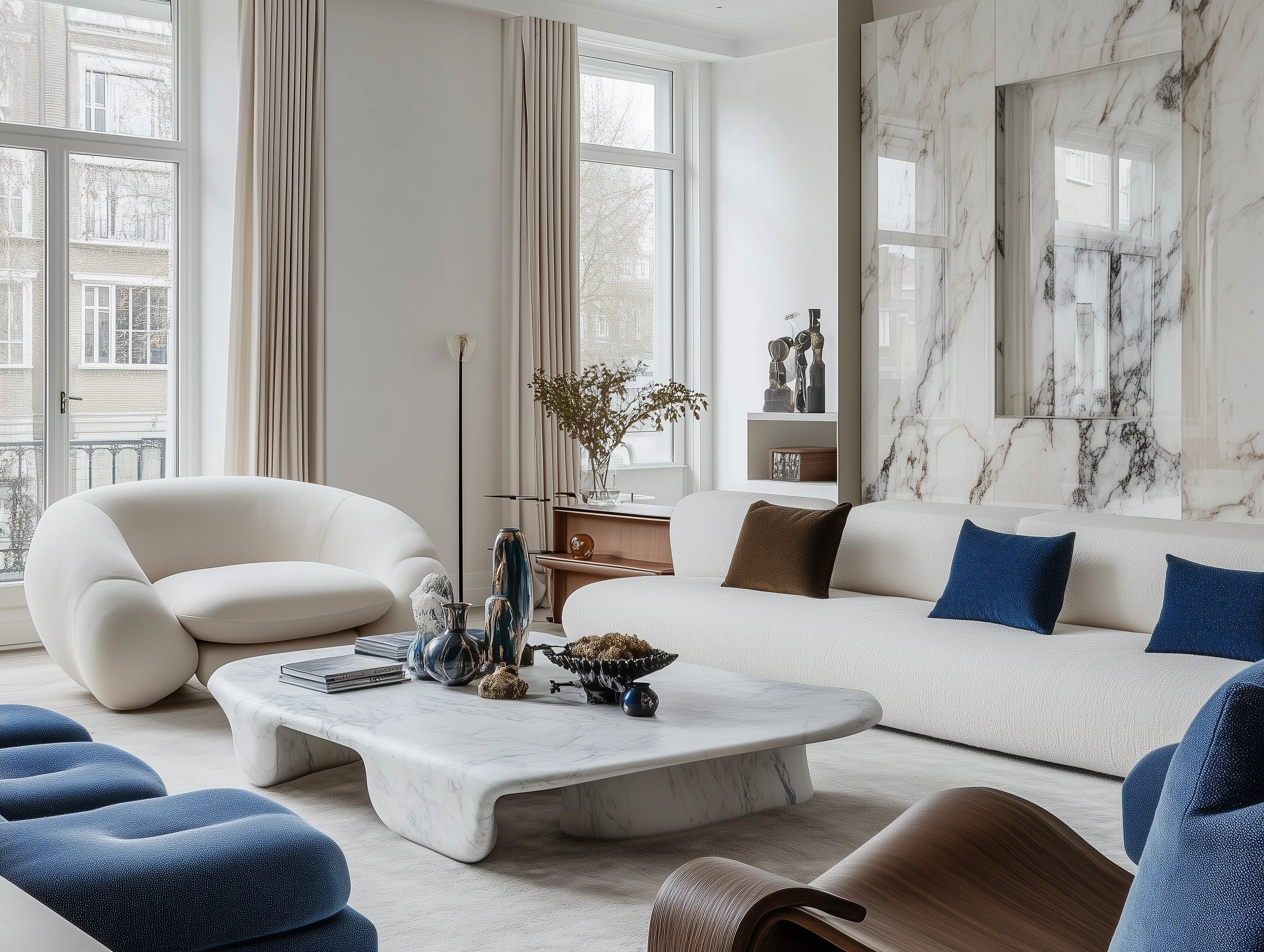
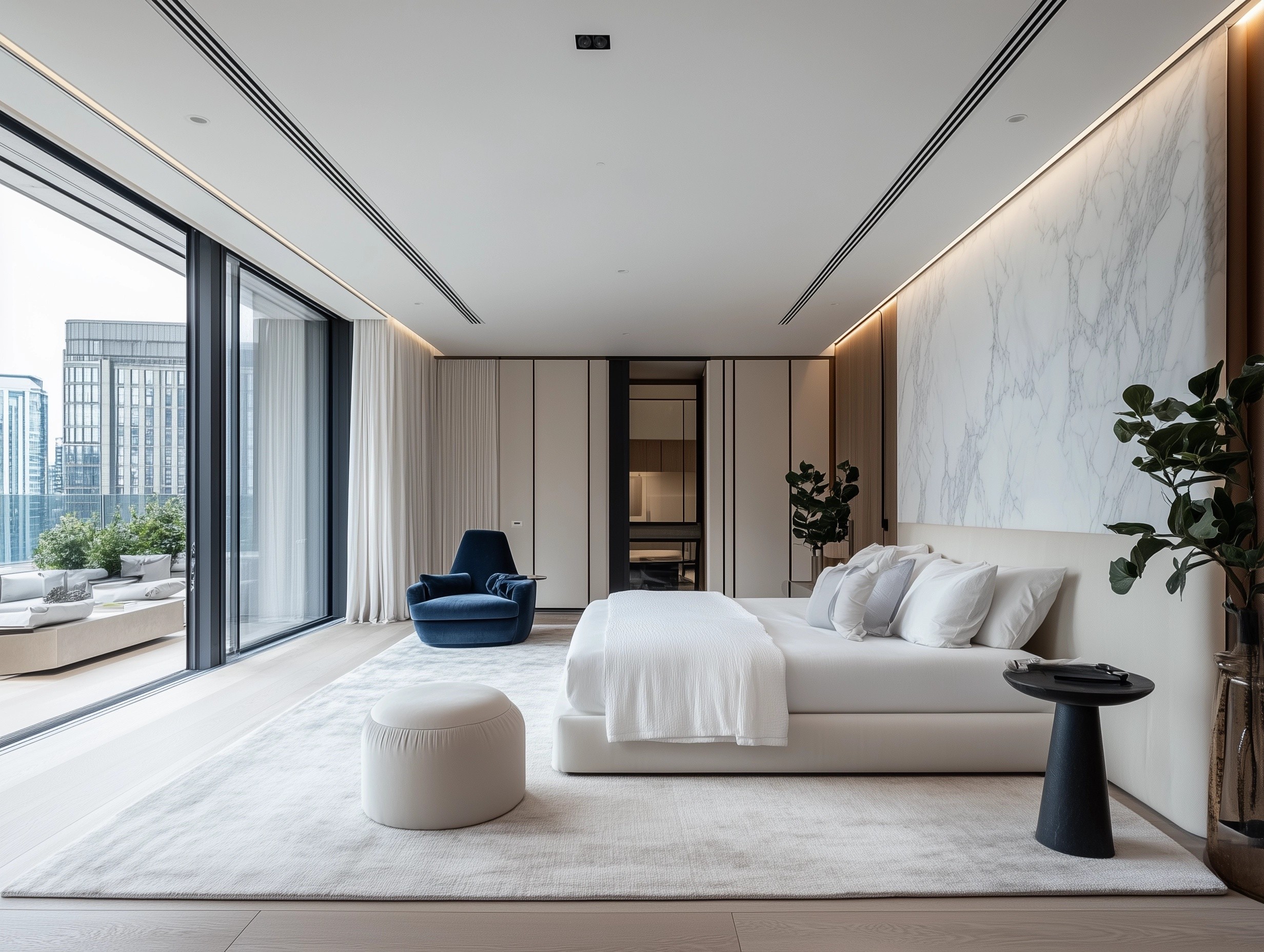
However, working with neutrals is about more than just selecting the right colors; it's also about creating balance and harmony throughout the room. We strategically used contrast to give the space dimension—for instance, pairing darker hues like charcoal or espresso wood finishes with lighter elements. Adding natural materials and finishes brings in a tactile element that enriches the overall feel. By carefully considering each element’s weight and texture, we crafted a space that feels fresh and modern yet timeless, proving that neutrals can be as dynamic and expressive as any bold color scheme.